5 Website Usability Testing Tips – Why Should You Care About Them?
Usability testing helps bring together the website structure and makes it user friendly. It is a method used to improve the web layout, to make it easy-to-use and easy-to-understand. A simple quick definition of Usability, it is comprised of 5 quality components:
- Learnability
- Efficiency
- Memorability
- Errors
- Satisfaction
“Every dollar invested in ease of use returns $10 to $100.” – IBM
Anything you put on your webpage to make your website feasible and to make users interact more easily with it, counts as usability. Recent studies identified companies committed to ease-of-use actually exceed anticipated earnings, meaning it results in: more conversions, satisfied customers, long-term relationships, better ROI and more…
Now, also for the sake of search engine ranking success, you need best user experience on your website. The result is a win-win situation. According to Steve Krug, usability means to make sure a person of average (or even below the average) ability and experience can use the thing – whether it is a web site, remote control, or revolving door – for its intended purpose without getting hopelessly frustrated.
In this post, I’m going to offer 5 testing tips to provide a better user-experience and to help users interact with your website anywhere in the world from any device.
So before launching any new webpage or making any major or minor amendments, you need to test 5 key things:
1. Cross-Browser Testing
Making your website cross-browser compatible is a necessary task that can’t be overlooked as all your marketing efforts are based upon how you maintain your digital presence. A broken website is akin to playing a game with the wrong keys!
a) Browser Compatibility Check
Website doesn’t look identical on every browser until it is compatible with them. Any minor or major amendments to coding can change the display of the web pages. You need to be very careful while uploading new files, changing code, making CSS changes or adding JavaScript/jQery code (these often conflict) may create layout issues. Sometimes the web structure looks fine in one browser but is messed-up in others.
I coded a simple HTML with little encoded CSS styles
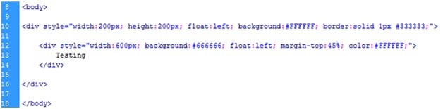
and view that in Google Chrome and IE7
Google Chrome allowed adding a long container under a small box where IE7 stretched the small box exactly the same as the width of the long container.
You can evaluate your website layout with a number of different tools. Adobe BrowserLab (Free) and Browsershots (Free) are quite popular and easy to use. Just put your website link into these free tools and check your it’s appearance on multiple browsers with different versions in Mac, Windows and Linux.
Here is a list of different tools available for Cross-browser checking:

Image Courtesy: Smashing Magazine
b) Screen resolution
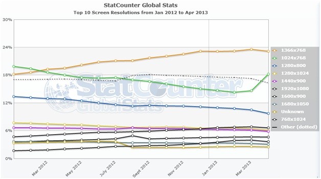
 According to StatCounter, 1366×768 pixels overtook 1024×768 but suddenly in April 2013 1024×768 increased to 18.22% from 14.64% – maybe it is for a while or it will stay longer or rise-up. For now the most popular screen resolution worldwide is 1366×768, for computers. This new dominant screen resolution is a particularly important statistic for web-developers, as they can now make their designs more optimized for 1366 pixels-wide screens from the beginning.
Your pages should work at any resolution, from 800×600 to 1280×1024 and beyond. It can be a difficult task to make your websites compatible for many resolutions so you can check Google Analytics to know your audience.
Make sure to test your pages for the visitors screen resolutions before and after code changes.
What to check?
- Readability: By readability I mean how easy your text is to read at a different resolution? If the content is hard to read, visitors may never understand anything and bounce back.
- Visibility: Put the most important information “above the fold” so users can see it without scrolling. If an “add to cart” button or other key elements appear after a long scrolling, users may never get around to it.
- Aesthetics: It means how the elements of your website look when users see it from different screen resolutions. All the elements should be lined-up correctly, accurate in size and aligned properly.
2. Functionality Testing
Test whether your website functions properly, meets the quality guidelines and provides the target specification (maybe decided in the SOW)
c) Forms Validation
Different forms have their own requirements i.e. registration, login, newsletter, payment, add to cart etc. All forms should work according to their specifications as this is one of the direct ways that make customers connect with the website.
What to check:
- Formatting – should be consistent and professional looking.
- Fields marked mandatory are actually required?
- Message appears when a mandatory field is left blank
- Error messages must be appropriate and helpful
- Form fields must accept only valid formats (typically zip code, email address, fax and phone number, etc.)
- TabIndex must be controlled and working properly
- Test the form several times, each with different values
- Email must go to the correct location
- Thank you page must appear on submit
d) Link Action
Pay close attention to link action of newly added pages so that you can refer users to the appropriate pages where necessary. Test all the links for correct link targeting, broken internal and external links, to ensure a greater user experience. You may use Xenu to run the broken links report.
What to check:
- Outgoing links for all the pages from specific domain
- All internal links
- Links are going to their respective pages
- Link to the email addresses should go to the correct person and must have mailto:
- Links are consistent & easy to identify
- Easy to access and must link to the main navigation.
- Test to check if there are any orphan pages
- Lastly check for broken links
3. Technical Testing
e) Content Checking
Content is a voice – your conversions depend on how you speak to the audience. It is also a major part of usability testing. All the newly created content produced should have familiar sound, and be logical, readable, and grammatically correct.
The content must have these, for greater user experience:
- Get to the point as quickly as possible.
- Cut out unnecessary information.
- Avoid long sentences, use language that is easy to understand and stick to common words and phrases.
- Use Headings to Break-Up Long Articles
- Use Bulleted Lists and Text Formatting
- Give Text Blocks Sufficient Spacing
- Make Hyperlinked Text User-Friendly
- Use Visuals Strategically
What to check:
- Content formatting
- Easy to read
- Canonicalization for duplicate content pages
- Content shouldn’t be copied from other websites
4. Accessibility Testing
f) Page Performance
Every page when added on the website must pass through the Page speed test so that the page opens smooth and faster. Sometimes the code is not compatible to load, images are too heavy, and lots of hardcoded styles and scripts will make the pages hard to load.
You can evaluate your web page with the help of YSlow and Google’s Page Speed. These tools are available for Firefox and Google Chrome browsers. (You need to have firebug installed, before you download YSlow in Firefox!)
Tools to Download
YSlow for Google Chrome: https://chrome.google.com/webstore/detail/yslow/ninejjcohidippngpapiilnmkgllmakh
Page speed for Firefox and Google Chrome: https://code.google.com/speed/page-speed/download.html
YSlow for Firefox: https://addons.mozilla.org/en-US/firefox/addon/YSlow
Recommended Firebug tool: https://addons.mozilla.org/en-US/firefox/addon/firebug
What to check:
Web page must score as high as possible. Best score is 100/100
5. Mobile testing
Users expect websites to be optimized and functioning properly for their various mobile devices so they can access the website anywhere they need to.
Before you launch new features and/or major and minor changes on a website check them on iPhone, iPad, and different mobile versions to ensure that your site looks fine and is working properly. Adobe Shadow (Free), MonkeyTalk (Free and Paid) and Perfecto Mobile (Paid) are great tools for designers, developers and for QA testers.
Look at these areas for mobile testing from a simulator and physical device:
- Test every page and view every function
- Submit the forms multiple times, check the quality of images and click on every link
- Test in different modes i.e. Portrait and Landscape
- Test your website on the most recent and older iPhone versions to ensure that your website will work fine for every user
Conclusion
Testing isn’t a onetime event, but part of the culture at data driven companies. Be sure that you’re using the right tools and testing continuously. Websites should render properly in multiple browsers and on mobile devices. You must carefully check the website functionality, content and web page performance.
Please share your thoughts in the comments below 🙂
Special Thanks to @Sha Menz for the copy-editing help.
Kumail Hemani
Kumail Hemani is an SEO Consultant and a full-time SEO Manager at a well reputed SEO Agency. He is a passionate blogger and loves content marketing. He also helps businesses increase search and online visibility through online media. You can read more about him HERE or get in touch with him on Twitter or Google+
Follow Me:


Kumail,
You listed some valuable steps and tools. Your steps to a better user experience should also result in better SEO performance as well!
Hi Lookado,
Absolutely! Thanks for the comment 🙂
Pingback: How To Answer Clients’ Questions About SEO | InkThemes
Such a great post, I believe the key to the usability of your website is in creating a consistent and obvious navigation, since users are impatient, they won’t spend time in searching for it.
Thanks
Ann Daniel